PHOTO
While not as major as the construction of an entirely new school, the completion of a brand refresh for Bombala High School this year has given the school a new lease of life.
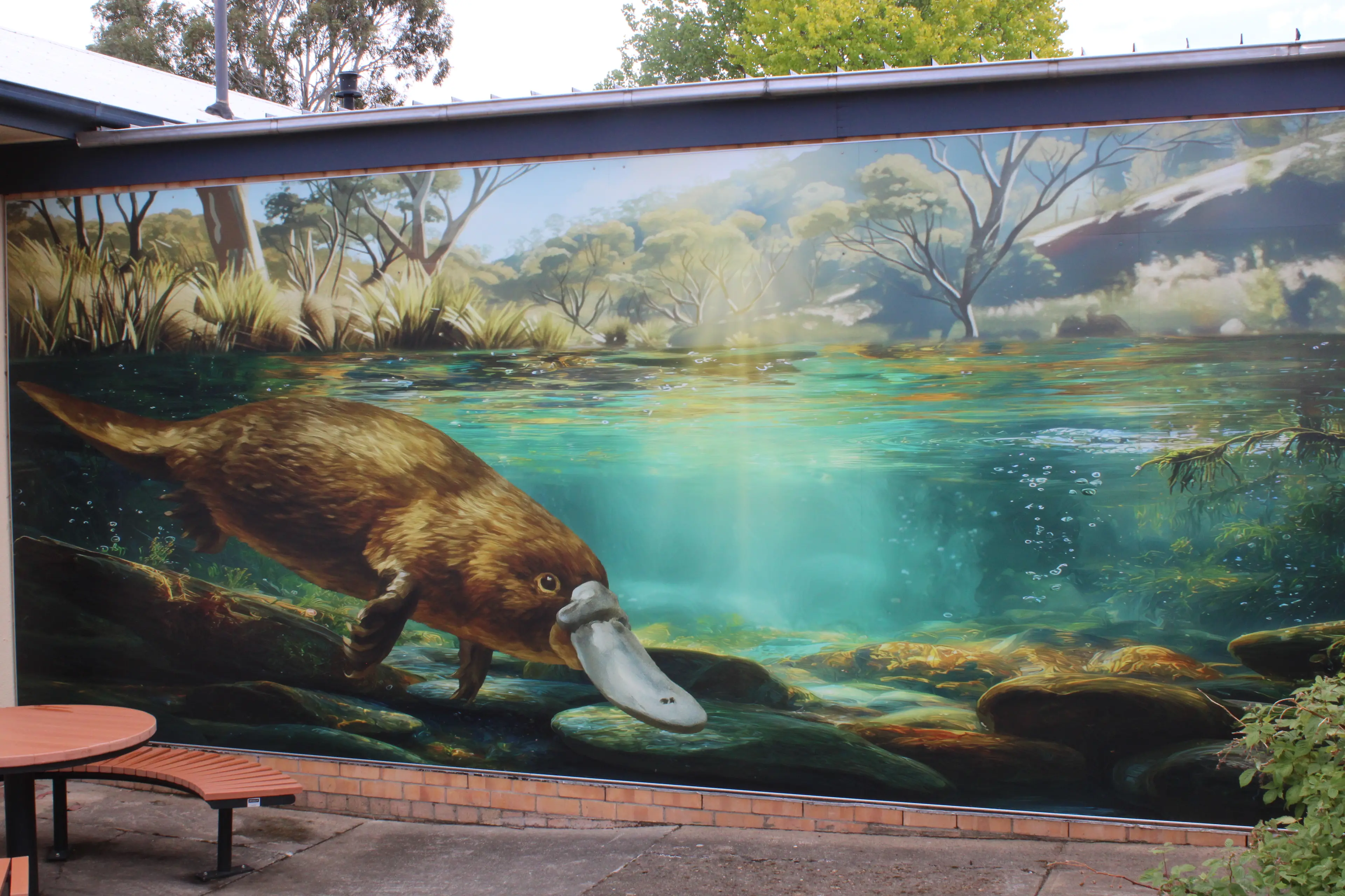
The most obvious change in the school is an extensive artwork upgrade, in addition to a logo alteration.
Bombala High School principal, Jai Lester, is delighted with the outcome of the year-long project with the graphic artists.
"The start of the school re-branding wasn't originally intentional, but began as we started to consolidate other projects that we are completing in the school," Mr Lester said.
"We are still proud of our old school crest but we realised it was struggling to capture our unique identity - we discovered that many, if not most, schools our age have the crest and wreath design as well.
"Additionally, we wanted to ensure that the graphics we introduced to the school captured our local context but also made specific learning spaces exciting and engaging for our students. We have been extremely lucky to work with outstanding graphic artists from Edugraphix who have painstakingly worked through numerous rounds of drafts to get to a product of this calibre."
The new Bombala High School logo mark is a powerful local symbol, representing the unique natural environment of the region.
The branding style guide states: "Its flowing, curved form suggests adaptability, curiosity, and quiet strength - qualities the school nurtures in its students.
"Positioned as if diving, the platypus also reflects a journey of discovery and learning beneath the surface.
"The Bombala High School logo features a stylised platypus - iconic of the area - diving beneath a flowing wave, symbolising connection to the local environment and the region’s waterways. The clean, modern typography in deep blue tones evokes trust, stability, and pride, while the gentle curve beneath the text reinforces a sense of movement, growth, and continuity in learning".
The primary colour palette for Bombala High School is reflective of the surrounding environment. The river is represented by the blues and the heritage is represented by the red.
The graphic device in the school branding is also significant.
The style guide states: "A graphic device in school branding identity is like the school’s visual handshake; it’s the first and most enduring impression. For a school, it’s more than just a logo - it’s a distillation of its values, ethos, and aspirations into a single emblem. It serves as a beacon, rallying students, educators, and the community around a shared identity.
"The River Map Device graphic is a stylised map of the Bombala region, simplified into flowing lines and organic shapes.
"It subtly honours the school’s deep connection to place - the rivers, valleys, and networks that define the local landscape. As a design, it speaks to connection, direction, and belonging, while offering a fresh and uniquely local identity for Bombala High School. It’s a thoughtful way to reflect where the school stands - both geographically and in the lives of its students".
Mr Lester said being able to integrate the new logo design is special.
"For decades the platypus has been an unofficial mascot of the school and the Bombala region," he said.
"To be able to integrate the platypus and river motif into our official motto means a lot for our school community – we have a logo that is distinctly us and celebratory of the town we come from.
"A platypus has always been a mainstay in our school's artworks, so to have it merged into a new logo which is uniquely Bombala is special.
"We have had nothing but glowing feedback from the local community and we are exceptionally proud to show off a logo that is distinct to us wherever we go," Mr Lester said.